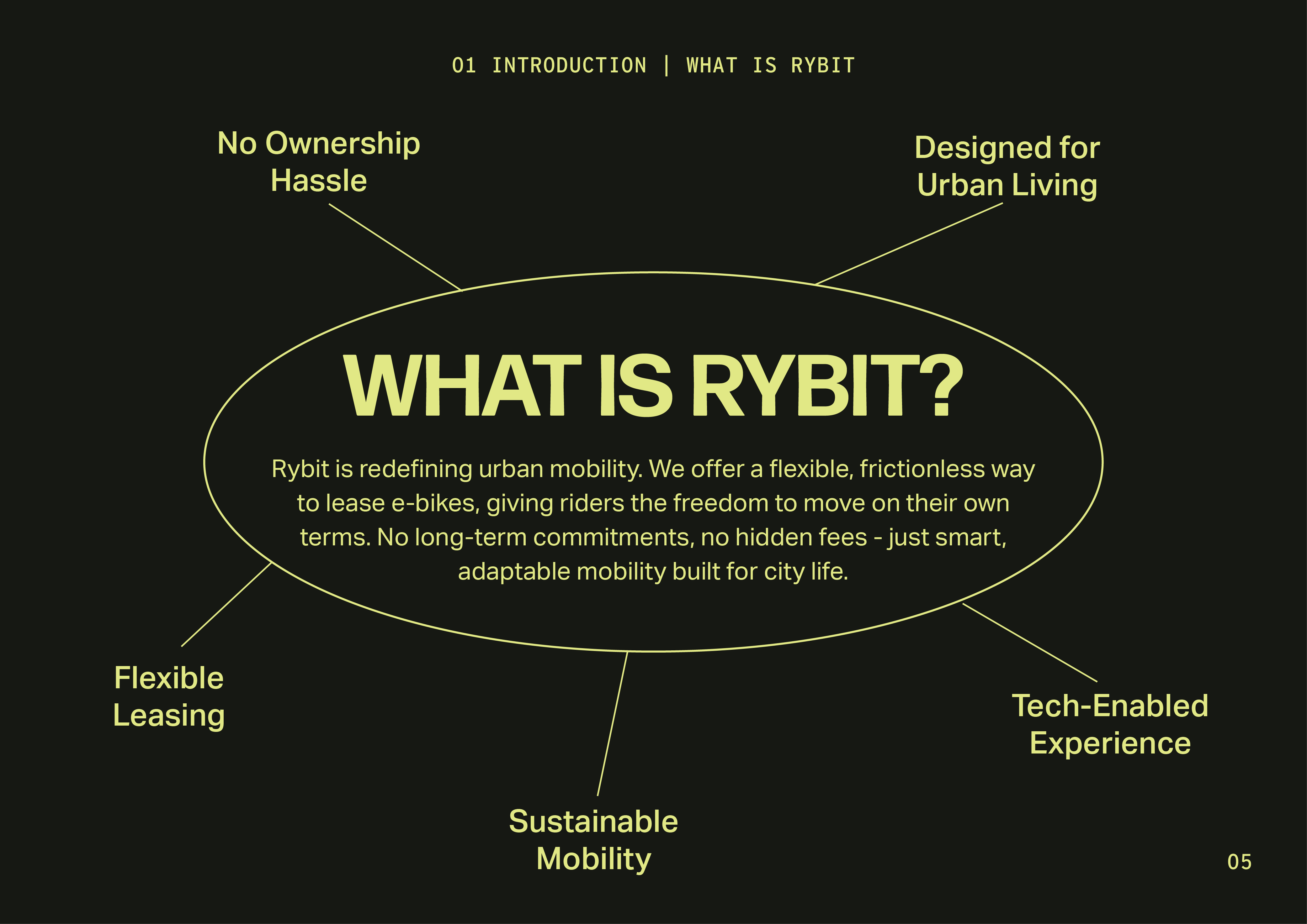
Rybit
I independently led a full rebrand for Rybit, an urban mobility company redefining how people lease and ride e-bikes. My goal was to create a brand that felt premium, adaptable, and tech-forward, while remaining clear, bold, and playful.
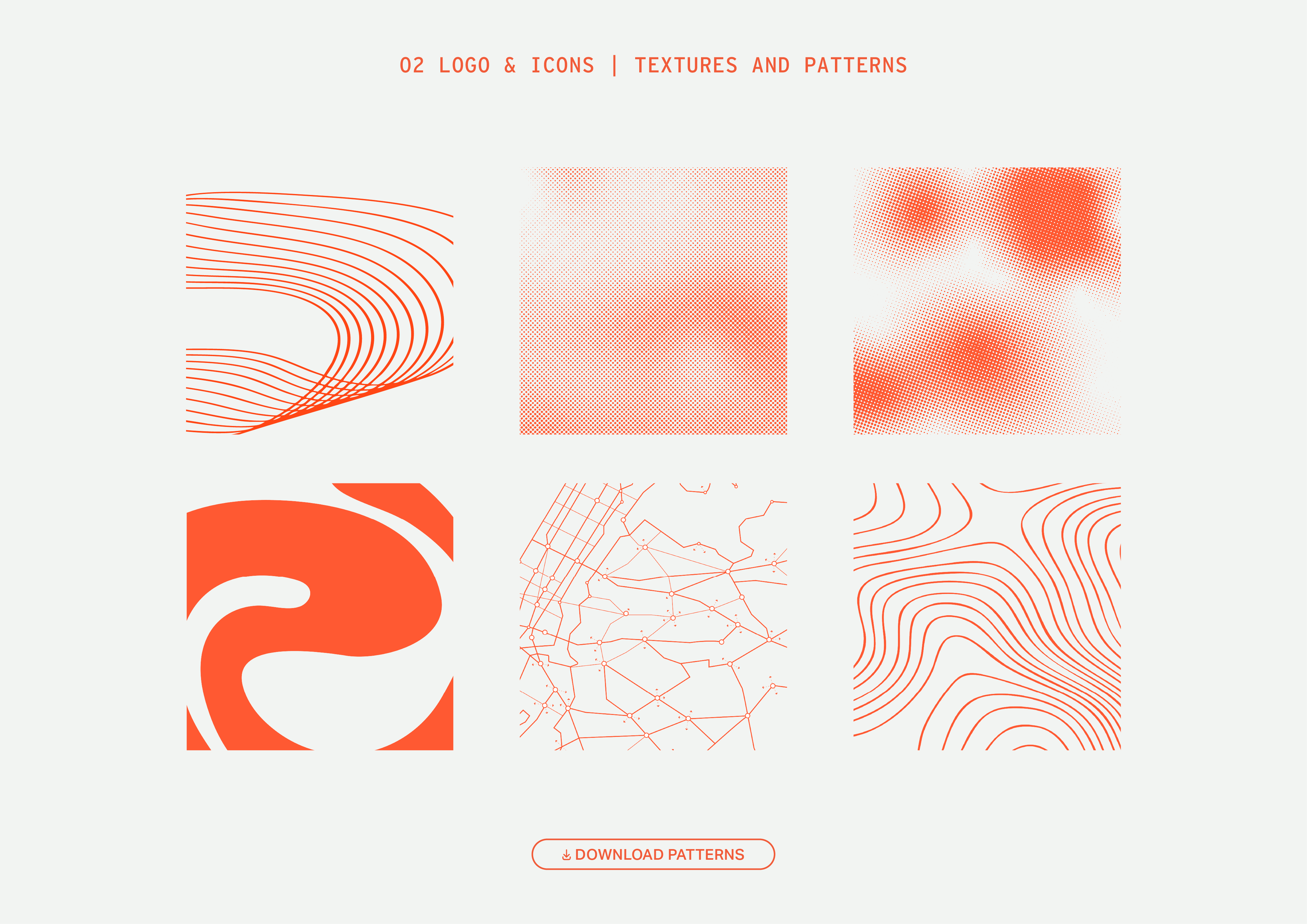
I developed a comprehensive brand guidelines document from the ground up, covering everything from logo usage and typography to color palette, voice and tone, and system-wide application rules, ensuring consistency across all brand touchpoints.
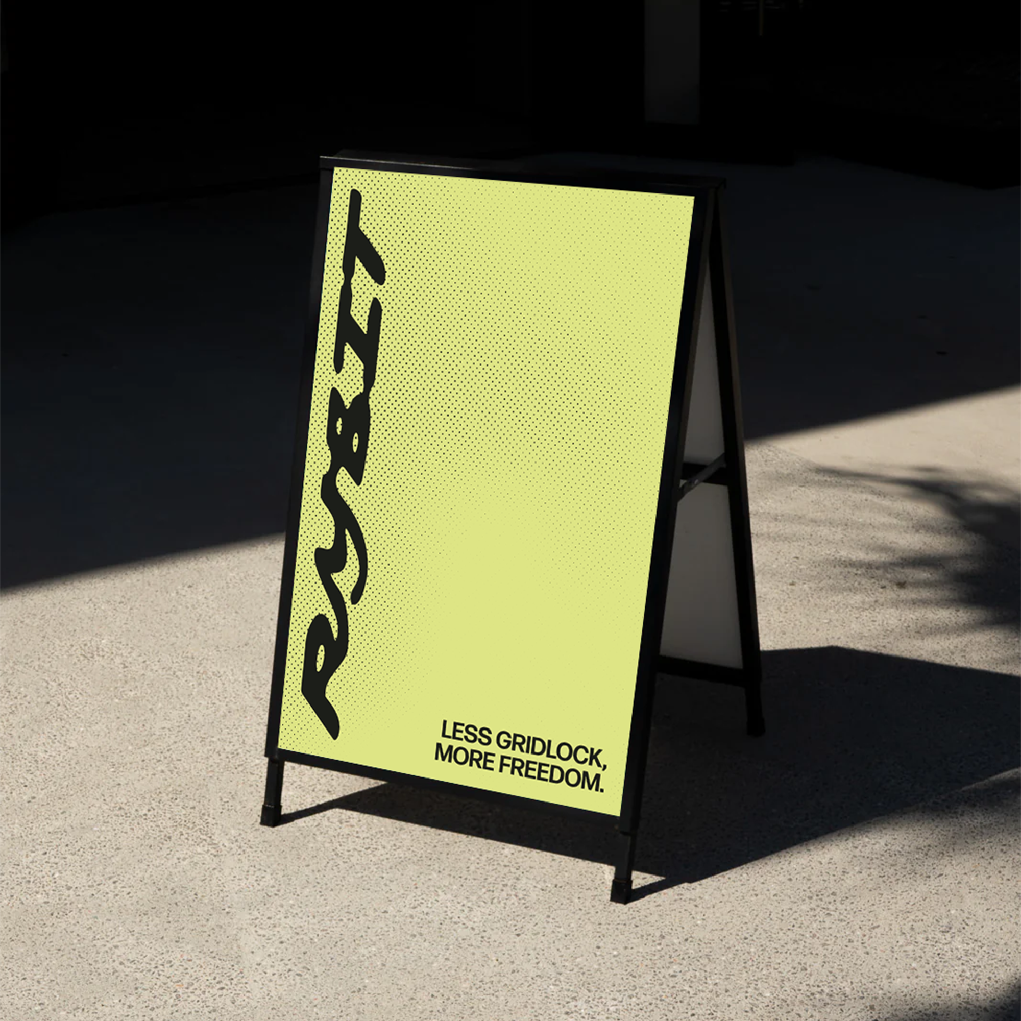
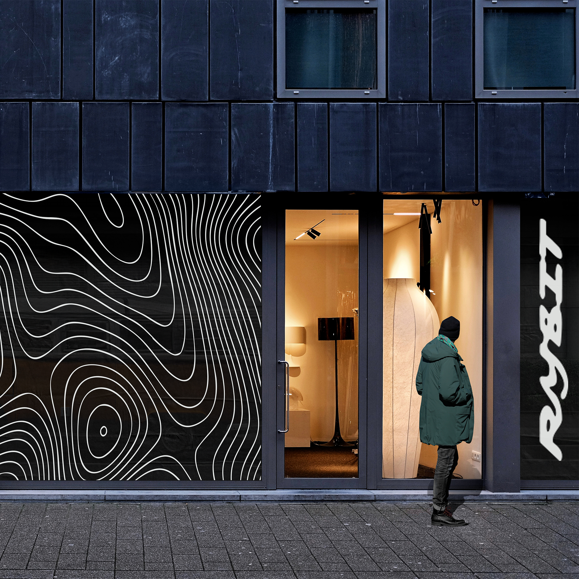
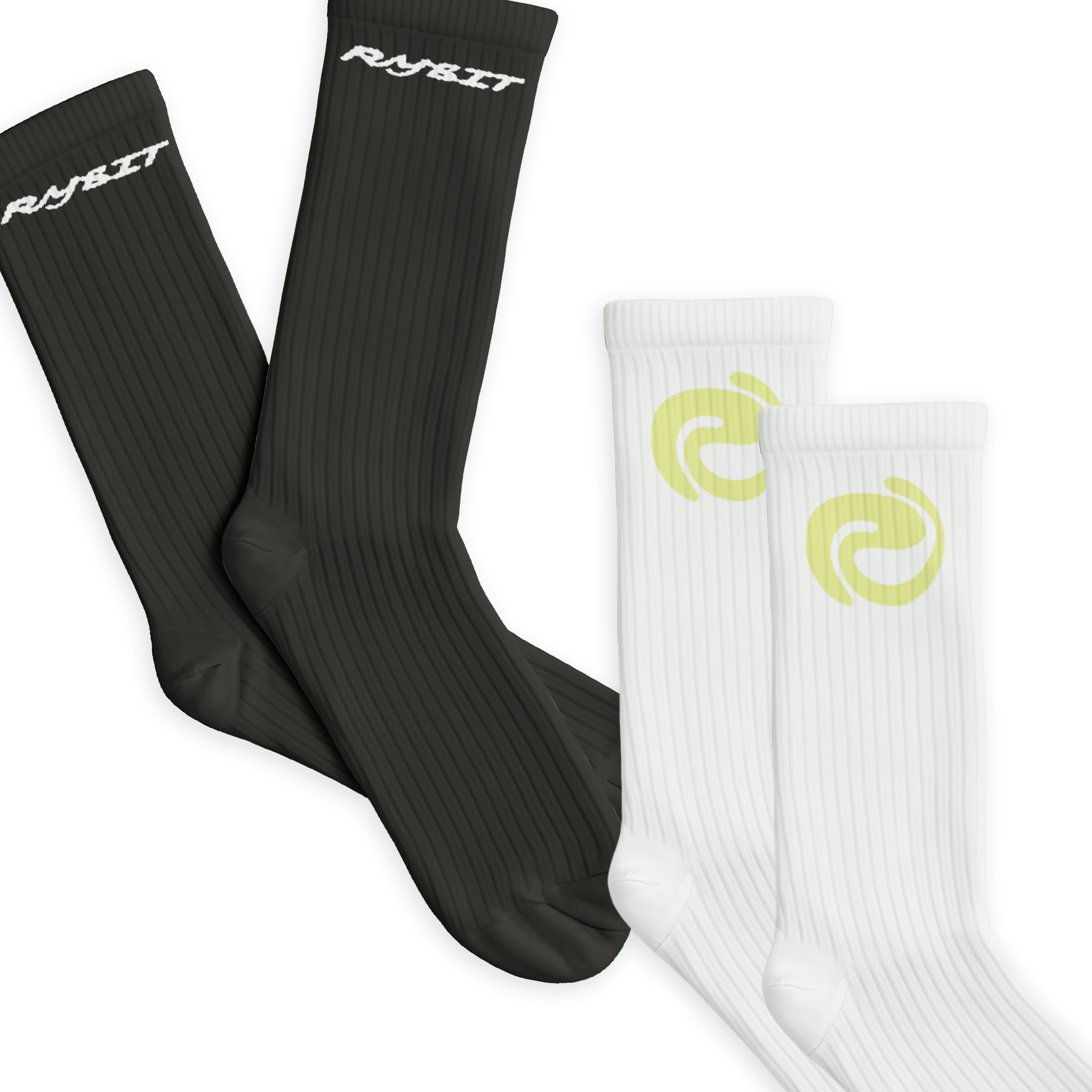
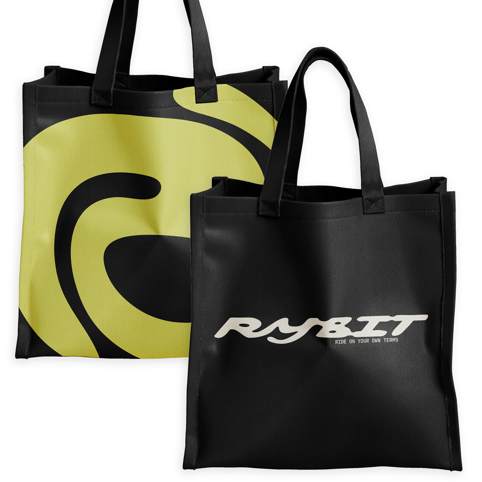
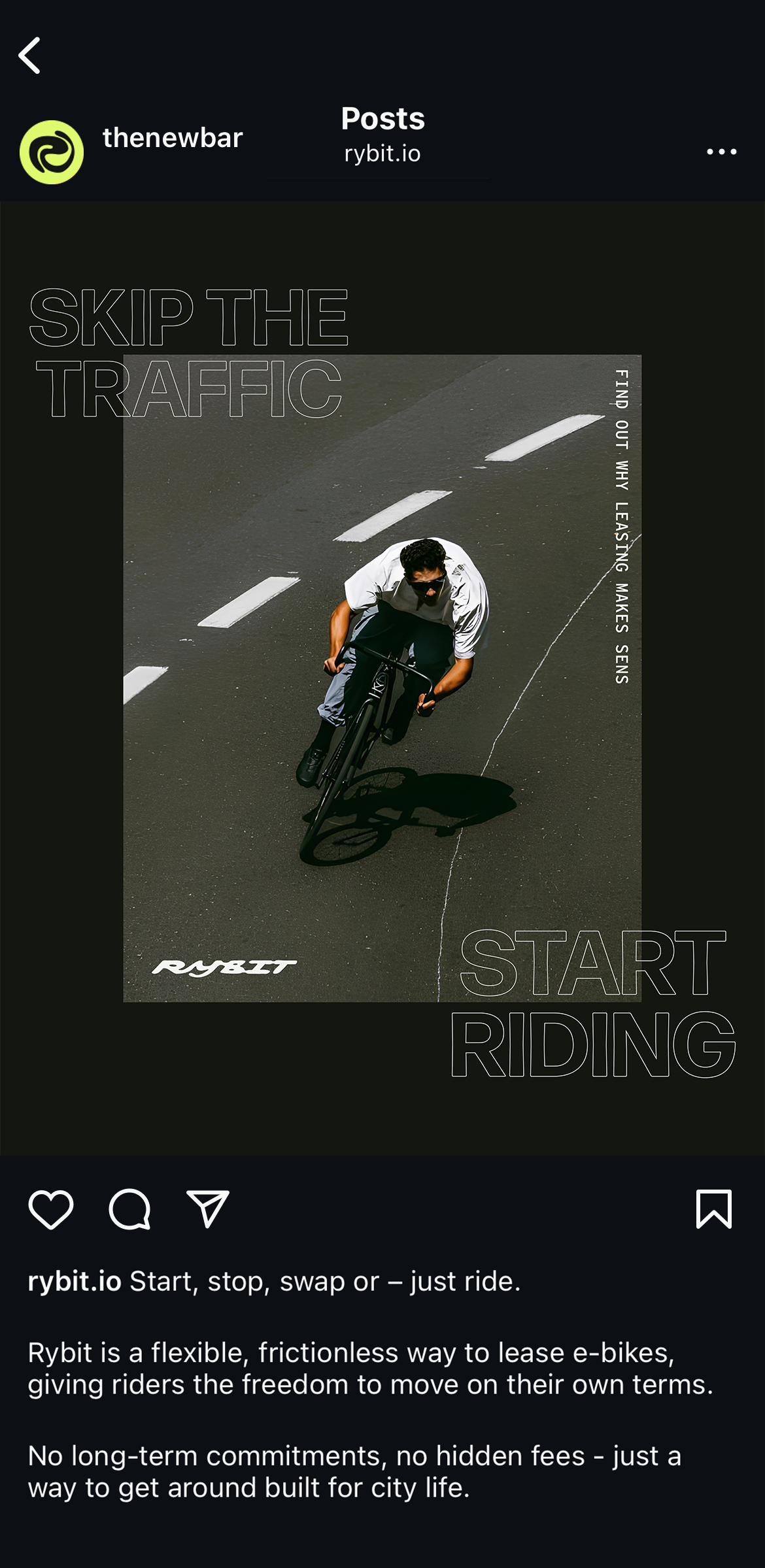
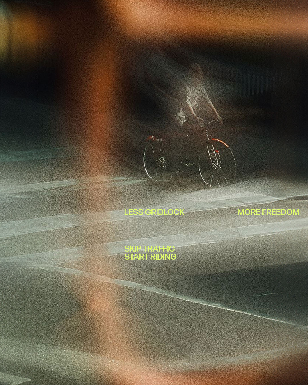
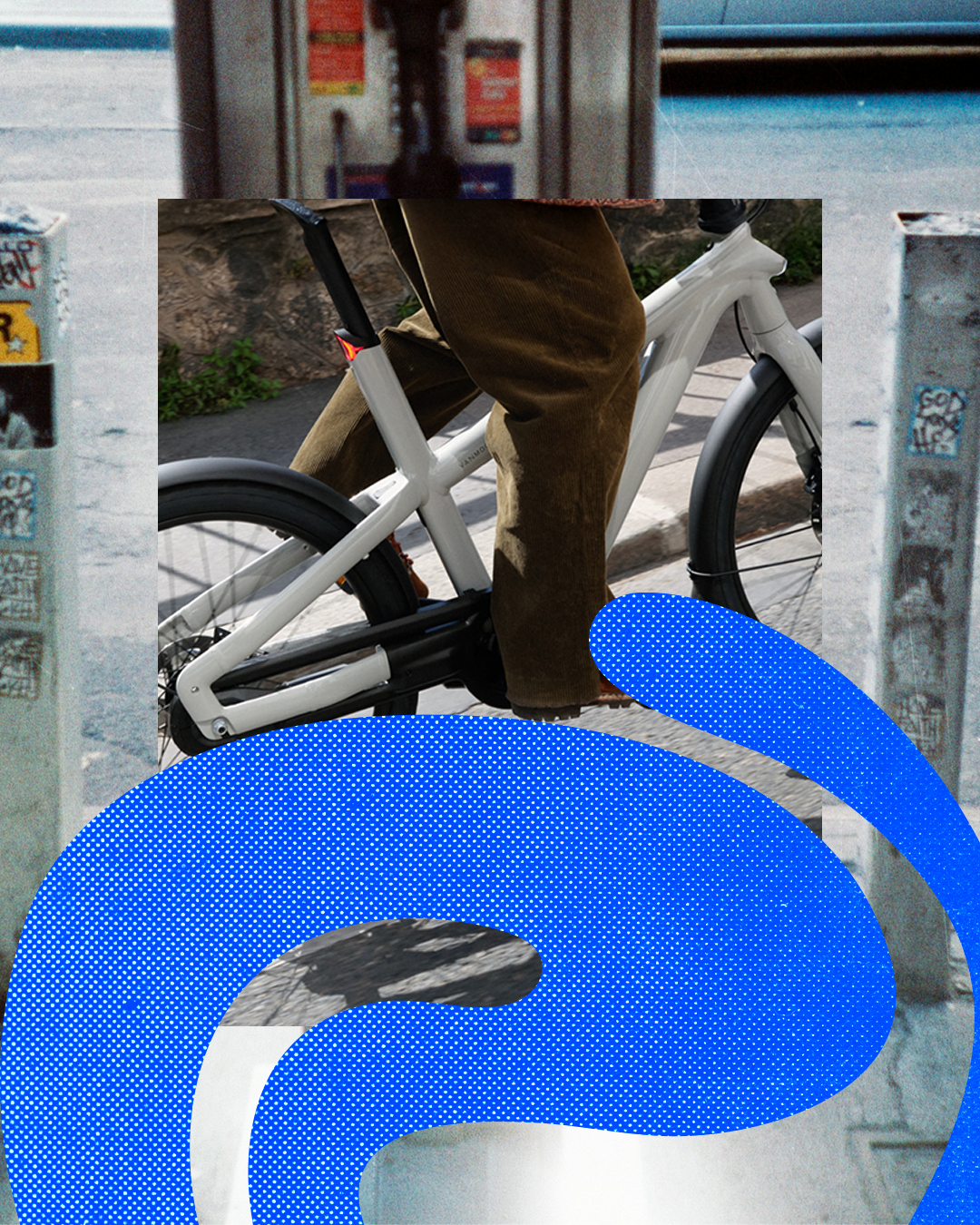
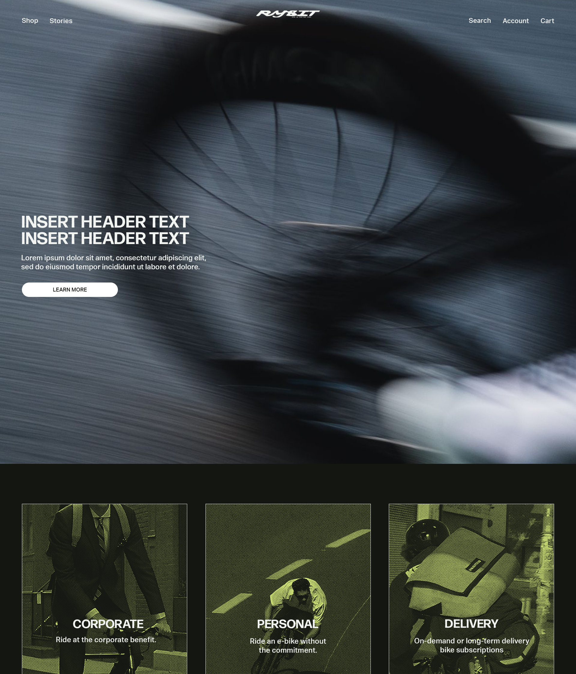
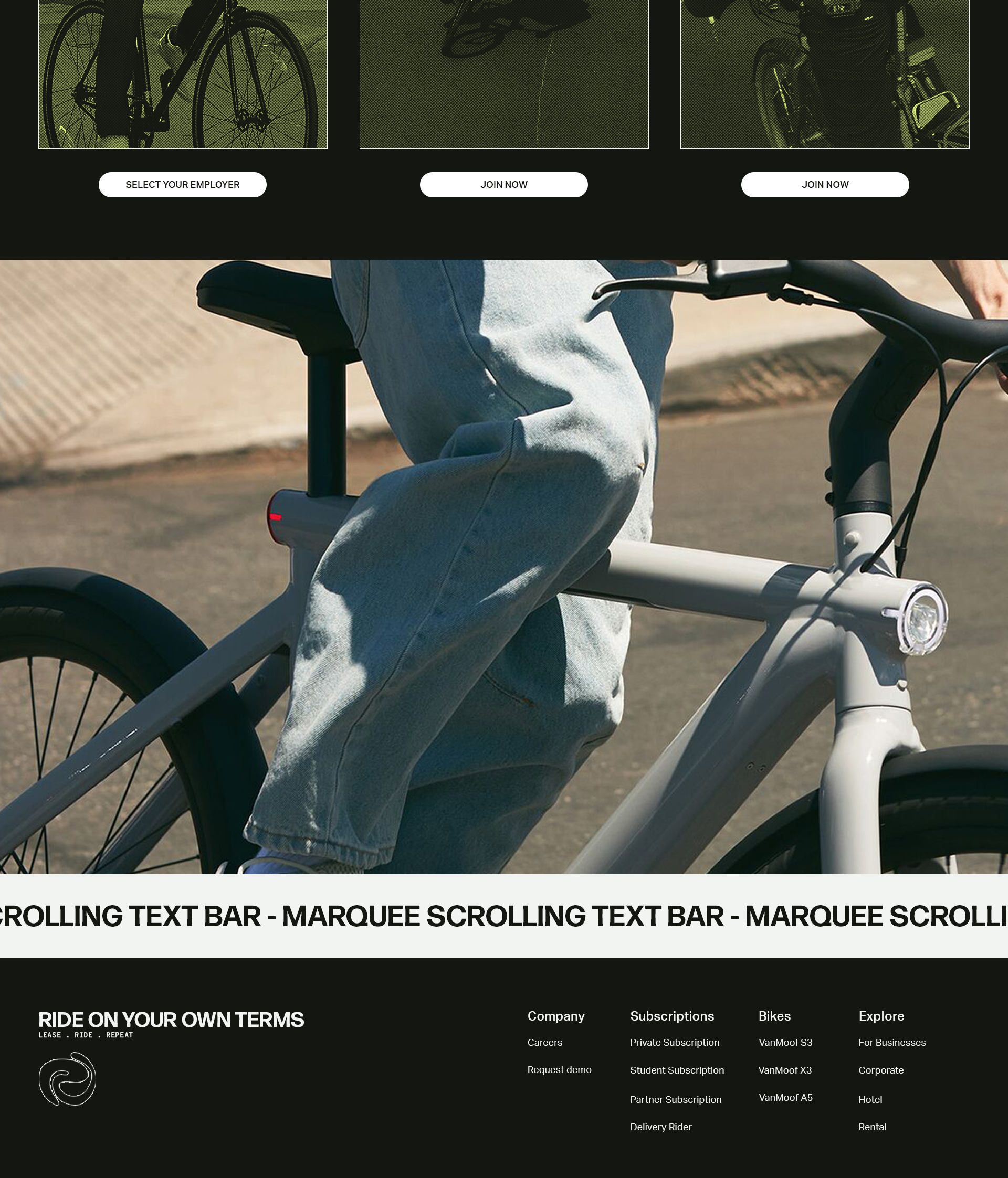
To bring the system to life, I designed a wide range of branded applications and templates for both digital and physical use. This included an A-frame sign, event flyer, in-store visuals, merch, custom patterns, social media graphics, a website landing page, and window decal stickers. Every asset was crafted to feel cohesive yet flexible enough to evolve with the brand.
Full Brand Guidelines PDF
A detailed brand system defining Rybit’s identity - from strategy and voice to visual execution and usage.
In-Store & Street-Level Branding
Eye-catching decals, signage, and visuals to drive awareness and create a strong brand presence in and around retail spaces
Branded Templates
Custom-designed layout templates using non-owned, placeholder imagery, intended to guide Rybit’s branded content without implying image ownership